

Mental Models

Aligning Design Strategy with Human Behavior
There is no single methodology for creating the perfect product—but you can increase your odds. One of the best ways is to understand users’ reasons for doing things. Mental Models gives you the tools to help you grasp, and design for, those reasons. Adaptive Path co-founder Indi Young has written a roll-up-your-sleeves book for designers, managers, and anyone else interested in making design strategic, and successful.
There is no single methodology for creating the perfect product—but you can increase your odds. One of the best ways is to understand users’ reasons for doing things. Mental Models gives you the tools to help you grasp, and design for, those reasons. Adaptive Path co-founder Indi Young has written a roll-up-your-sleeves book for designers, managers, and anyone else interested in making design strategic, and successful.
Testimonials
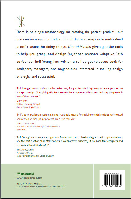
Indi Young’s new book is a welcome addition, covering an aspect of the design process that is extremely important but often neglected. The book is chock-full of practical advice derived from real-world development projects, but doesn’t lose sight of the broad conceptual underpinnings.
–Ray Valdes, Research Director, Web Services, Gartner Inc.
Mental Models offers a practical set of techniques for task analysis in the early stage of design thinking and strategic design planning. Developed over the course of more than ten years, Indi Young’s common sense approach focuses on user behavior, diagrammatic representations, and the participation of all stakeholders in collaborative discovery. It is a book that designers and students, alike, will find useful.
–Richard Buchanan, Professor of Design, School of Design, Carnegie Mellon University
At Dow Corning, Mental Models offer understanding at many levels—from a high level overview of customers’ generic unmet needs, to providing a detailed examination of the atomic tasks that they carry out as part of their jobs. So too for this indispensable book—it offers both a high level overview of the value of Mental Models for executives and leaders, as well as a detailed step-by-step guide to the technique for practitioners. Indi has eloquently captured the essence of Mental Models and offers her unrivaled experience to everyone.
–Simon Parker, Global Process Manager, Front End of Innovation, Dow Corning Corporation
Mental models reveal all those things that should be obvious during the design process, but so often come back to haunt you later. Indi’s book provides a systematic and invaluable means for applying mental models; having used her method on many large projects, I’m a true believer.
–Camille Sobalvarro, Senior Director, Web Marketing & Communications, Sybase Inc.
Table of Contents
Chapter 1: What and Why? The Advantages of a Mental Model
Chapter 2: When? Using Mental Models with Your Other Work
Chapter 3: Who? Mental Model Team Participants
Chapter 4: Define Task-Based Audience Segments
Chapter 5: Specify Recruiting Details
Chapter 6: Set Scope for the Interviews
Chapter 7: Interview Participants
Chapter 8: Analyze the Transcripts
Chapter 9: Look for Patterns
Chapter 10: Create the Mental Model
Chapter 11: Adjust the Audience Segments
Chapter 12: Alignment and Gap Analysis
Chapter 13: Structure Derivation
FAQ
These common questions about web accessibility and their short answers are taken from Indi Young’s book Mental Models: Aligning Design Strategy with Human Behavior. You can find longer answers to each in your copy of the book, either printed or digital version.
- What is a mental model?
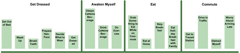
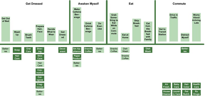
The top part of the model is a visual depiction of the behavior of a particular audience, faithfully representing root motivations. The bottom part of the model shows various ways of supporting matching behaviors. Where support and behavior are aligned, you have a solution. Where a behavior is not supported, you have an opportunity to explore further.
See page 2 for more information.